Question 7: Looking back at your preliminary task, what do you feel you have learnt in the progression from it to the full product?
Monday, 30 April 2012

Evaluation - Question 6
Question 6: What have you learnt about technologies from the process of constructing the product?
When filming and editing our film opening, we used different technologies to help us learn about new things and construct our work in new ways.
 One of the first pieces of different technology used was that all our editing was done on an iMac- most of the group had only ever used Windows computers before, so as a group we all learnt how to use a Mac computer. I personally had used Mac computers before, but I learnt more with having to use it over time. The Mac was used mainly in order to use the programs on there- iMovie and Final Cut Express; programs that you can't get on a Windows computer.

When filming and editing our film opening, we used different technologies to help us learn about new things and construct our work in new ways.
One of the first pieces of different technology used was that all our editing was done on an iMac- most of the group had only ever used Windows computers before, so as a group we all learnt how to use a Mac computer. I personally had used Mac computers before, but I learnt more with having to use it over time. The Mac was used mainly in order to use the programs on there- iMovie and Final Cut Express; programs that you can't get on a Windows computer.
I found that iMovie was a rather simple program that had a range of useful effects, despite being limited. It was easy to use with a simple timeline with effects such as transitions easily applicable to clips. I particularly found that the sound library accompanied with iMovie was very useful as we were able to use some of the sound clips in our final cut, alongisde royalty free music we found ourselves. I didn't haev any problems getting used to iMovie since I had used an older version before, but I still learnt about some new features I didn't know of before. There were weaknesses to iMovie, however- some simple things that wanted to be done couldn't, unlike with Final Cut Express. iMovie was mostly used for our remake of a film opening but was also used a little in our actual film opening.
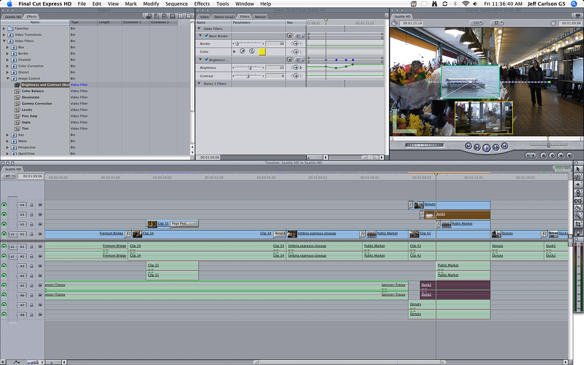 |
| The layout for Final Cut Express |
Final Cut Express was a program new to all of us, but I did have some previous knowledge that could be applied when using it- I had used Sony Vegas before, which is arguably the Windows equivalent of Final Cut Express. We were given a session beforehand on how to use Final Cut Express which we all found benefitial as it quickly taught us the basics. Editing in Final Cut Express took a while to get used to, but we all learnt how to do simple things such as splice clips and sort out audio fairly quickly. Other things, such as seperating the audio from the video clip, took more time as we had to work it out ourselves.
Final Cut Express was particularly useful for things such as titles- I was able to freely move around text, which I couldn't do in iMovie. There was a wide range of fonts that could be used which helped aid us in making sure the titles fit the generic conventions of comedy. There were also effects that could be applied to titles or clips in general- such as making things glow, distort, 3D effects, etc. We only used one effect that was on the main title of the film to help it stand out from the others, but we found it really enhanced it.
I personally found that whilst Final Cut Express was a lot more in depth and detailed than iMovie that allowed us to develop our film opening a lot, it was a bit fiddly and difficult to get used to (in comparison to Sony Vegas) which might've slowed us down a bit, but overall the program was effective. If I could re-do the opening with my current knowledge of Final Cut Express I would probably plan beforehand the sorts of effects and things I'd want on clips in order to be more organised.
)-1WebA1001001A11C18A22814F02436.jpg)
When filming, we used a tripod and a HD camera called Panasonic HDC-TM900. The tripod was useful for keeping shots steady although I think to improve we could've used it more, as some shots were held by hand and the framing would've been made better with a tripod. We had used a different camera for our pleminary task, which was then changed to the HD camera when we started our film remake. It was easy to use and helped with the way our final clips looked, as we could see on the screen if lighting needed to be adjusted.
On the day of filming we also brought another camera with us- Lauren's camera, a Nikon D3100. This was to help us with the clips for the filming diary as well as give us any back up clips needed. In the final cut we didn't actually use any clips from that camera, but it was handy as a back up in case any other shots were lost or we wanted a different kind of shot.
In order to log our coursework, we used Blogger- a blogging interface that allowed us to easily make seperate posts that were uploaded online. YouTube was also used to upload our videos onto- also simply done and annotations could be used as part of our evaluation. I personally found both of these websites very useful.
Overall, I think that using new and different technologies such as Final Cut Express and a HD camera allowed us to create and develop our film opening effectively, although there were some weaknesses and things we could've done to improve.
Friday, 27 April 2012
Evaluation - Question 5
Question 5: How did you attract/address your audience?
The answer to this question is seen through annotations in the video above.
The answer to this question is seen through annotations in the video above.
Thursday, 26 April 2012
Evaluation - Question 4
Question 4: Who would be the audience for your media product?
 We originally decided during planning for the certification of our film to be a 12A- we have decided to still stick with this certification after having finished our final cut.
 With regards to audience theories, I still think that the main theory which applies to our piece is the hypodermic needle theory. This is a common audience theory used with comedy films, as the audience is able to be passive and purely intake the information given without having to put too much thought into what is going on- meaning that the storyline and characters are simple to understand. A passive audience is an audience that only receives the information as a form of entertainment and doesn't do anything else with it, such as relate it to own ideas or question it.
However, the hypodermic needle theory applies more to popular mainstream films than it does to independent films- which is why I think another theory may be revelant. The other theory I think may still apply (but not as much as the hypodermic needle theory) is the uses and gratifications theory. The uses and gratifications theory means that the audience is active- they could find the film relatable to their own lives; use it to escape their own lives as a form of entertainment and learn more about relationships and social interaction. For example, someone watching our film may relate one of the main male characters to themselves due to the stereotypes used, which are common but relatable to teenage culture.
 We originally decided during planning for the certification of our film to be a 12A- we have decided to still stick with this certification after having finished our final cut.
From research we know that a lot of comedy films are often of a 12A certification or above, normally due to factors such as there being violence or swear words. Whilst this is not necessarily seen in our opening, it will be something considered later on, which is why we chose this certification.
Specifically, I think that our film would attract mostly to teenage boys (13-18 years old) who are into comic books and super heroes- this is mainly because of the themes running throughout our film as well as the storyline as a whole. From research we know that action and comedy as well as things like super heroes are stereotypically enjoyed more by males than females.
The demographic group we decided the audience would be for our film opening were groups E and D. I still think this is the case after having completed the final cut, with the emphasis still focused on students. Demographic group E are students and our target audience is of around 13 to 18 years old- group D has also been considered to cover people who may be in part time employment. Nevertheless, this doesn't mean that our film is limited to this audience and may appeal to other people.
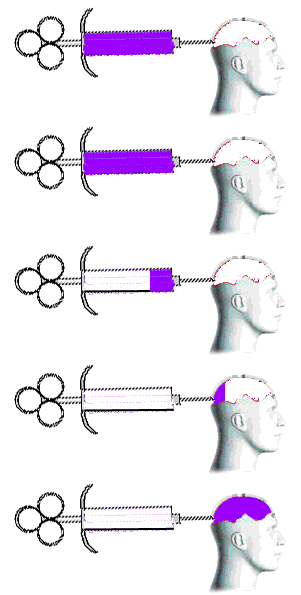 With regards to audience theories, I still think that the main theory which applies to our piece is the hypodermic needle theory. This is a common audience theory used with comedy films, as the audience is able to be passive and purely intake the information given without having to put too much thought into what is going on- meaning that the storyline and characters are simple to understand. A passive audience is an audience that only receives the information as a form of entertainment and doesn't do anything else with it, such as relate it to own ideas or question it.
However, the hypodermic needle theory applies more to popular mainstream films than it does to independent films- which is why I think another theory may be revelant. The other theory I think may still apply (but not as much as the hypodermic needle theory) is the uses and gratifications theory. The uses and gratifications theory means that the audience is active- they could find the film relatable to their own lives; use it to escape their own lives as a form of entertainment and learn more about relationships and social interaction. For example, someone watching our film may relate one of the main male characters to themselves due to the stereotypes used, which are common but relatable to teenage culture.
Wednesday, 25 April 2012
Evaluation - Question 3
Question 3: What kind of media institution might distribute your media product and why?
Tuesday, 24 April 2012
Friday, 20 April 2012
Evaluation - Question 1
Question 1: In what ways does your media product use, develop or challenge forms and conventions of real media products?
Thursday, 19 April 2012
Final Cut
This is our final cut. Modifications have been made since rough cut 2, such as the main film's title being made as well as minor things such as sound changes.
Wednesday, 18 April 2012
Rough Cut 2
This is our second rough cut. Changes have been made following audience feedback to help us improve.
Tuesday, 17 April 2012
Tuesday, 3 April 2012
Consideration of Sound
For the sound used in our film opening, we have planned for there to be non-diegetic music that turns to diegetic once the farmer playing guitar is shown. This means that the music would have to incorporate an acoustic guitar and fit to our genre of rural comedy. The video above shows some music we have considered having in our film opening.
Song #1
Whilst this music does involve an acoustic guitar, the tempo and feel of the piece does not quite fit the tone we want for our opening. Preferably the music would have to be more up-beat and start out with a fade in order to be suitable.
Song #2
This song also incorporates an acoustic guitar and starts out with slow strums- however, the song continues at this slow tempo which does not suit the tone we would like. Towards the end of the twenty second clip in which the music is heard a beat starts- this is also a disadvantage for this song as it would be better off if the song included only an acoustic guitar.
Song #3
Out of the three songs considered, this is perhaps the most suitable. On the other hand, it is as not as upbeat as would be liked and does not quite have an 'urban' feel that is most suited to our film opening. Whilst the strumming is good, it would be better if it could start out slow and then speed up.
Overall, none of these songs seem suitable enough for the final chosen one for our film opening, but by considering these ones (and others) we have been able to consider in more detail what kind of music we would like.
Sunday, 4 March 2012
Institutional Name and Logo
An institutional title logo is shown at the start of every movie, which brands what they produce- normally more than one is shown as institutions collaborate on a film.
History of The Logo
In the early days, institutional logos were very simple- a still image. As studios grew they added things to out-do other institutions.
In 1921 MGM (Metro Goldwyn Mayer) introduced 'Leo the Lion' into their logo, and Universal had a globe.
The video below shows how MGM's logo changed over time, from 1921 to 2008.
In the 1930s, 20th Century Pictures has a 'tower' logo and then merged with Fox to then become 20th Century Fox, as we know them today. Columbia Pictures, on the other hand, first started out with a woman with a sparkler, as seen in the video below:
By 1976 most production companies, except Universal, had changed to cel animation as a particular standard had become expected of institutional logos. In 1984 Warner Bros. switched back to a non moving still- a matte painting- in order to remain 'classic.'
In 1990 Universal had created a remastered digital logo.
As of 2007 nearly every institutional logo has been done on a computer and have reached a level of sophistication expected of htem.
My Logo Design
 When designing my logo design that may be considered for the final logo for my group Gemini, I thought about what the term 'gemini' can represent. The idea that came from this was constellations and stars, which is why I thought the logo should be animated to show stars appearing in a random sequence to then form the word 'Gemini.' To me, this idea seemed simplistic but effective and fits with the conventions of the institution being independent as it is not too extravagant or detailed.
I think that alongside this logo, simple sound could be used, such as slow music that fades in as the logo appears.
I made this logo (and the gif) using Adobe Photoshop CS3, with various layers and frames. I chose to make the initial idea digitally as I found it easier to do so than if I were to it draw on paper.
Here is my attempt at making the logo through a gif animation:

History of The Logo
In the early days, institutional logos were very simple- a still image. As studios grew they added things to out-do other institutions.
In 1921 MGM (Metro Goldwyn Mayer) introduced 'Leo the Lion' into their logo, and Universal had a globe.
The video below shows how MGM's logo changed over time, from 1921 to 2008.
In the 1930s, 20th Century Pictures has a 'tower' logo and then merged with Fox to then become 20th Century Fox, as we know them today. Columbia Pictures, on the other hand, first started out with a woman with a sparkler, as seen in the video below:
By 1976 most production companies, except Universal, had changed to cel animation as a particular standard had become expected of institutional logos. In 1984 Warner Bros. switched back to a non moving still- a matte painting- in order to remain 'classic.'
In 1990 Universal had created a remastered digital logo.
As of 2007 nearly every institutional logo has been done on a computer and have reached a level of sophistication expected of htem.
My Logo Design

I think that alongside this logo, simple sound could be used, such as slow music that fades in as the logo appears.
I made this logo (and the gif) using Adobe Photoshop CS3, with various layers and frames. I chose to make the initial idea digitally as I found it easier to do so than if I were to it draw on paper.
Here is my attempt at making the logo through a gif animation:
My choice of logo is effected by the type of film we are going to create because our film will be independent. The logo I have created is not too extravagent but is kept simple and effective, without appearing to be high budget and mainstream, (in comparison, for example, to Universal Studio's logo which uses CGI graphics) and to actually appear like an independent institutional logo. However, this logo does not necessarily represent the comedy genre of our film opening but is still made clear as an institutional logo.
Monday, 20 February 2012
Audience Expectations - Action Genre
As part of research into genre and expectations of genre, I interviewed various people on their opinions of the action genre, using the following questions:
Here are the results:
16 year old:
- What do you expect to see in the first 2 minutes of the film?
- What sort of main characters would there be? (Male? Female? Age?)
- What kind of event do you expect to occur/begin within the film?
Here are the results:
16 year old:
- In the first two minutes I expect an introduction to the movie, setting the scene
- I think the main character is most likely to be a middle aged man
- There would be build up to an action sequence such as a car chase
- Titles, introducing characters
- Male, around 25
- A fight that results in someone dying, explosions, etc
- There should be titles and introduction of characters
- A young female character, in her 20s, and a male who is a little older
- There would be build up to a gun fight
- The scene would be set, introduces one or two main characters
- Two middle aged males
- An intense fight that would involve explosions
- Introduction of character and setting, probably an urban area such as a big city
- Main characters would mostly be middle-aged men, with a few female characters
- A dramatic fight scene betweens rivals- the 'bad guys' and the 'good guys'
- Shots of the setting- a city
- Female and male characters, middle aged, probably rich or powerful
- A fight, conflict
Sunday, 19 February 2012
Film Opening Remake
The film opening we chose to remake was The Shining. (1980) We chose this film opening out of a selection of films and ultimately chose The Shining as we thought it would be more of a challenge to try and remake in comparison to a film opening such as Juno.
By doing this film opening we learnt more about time management and organisation- before we shot the film we had to create a storyboard and shotlist. This helped us be more prepared in what we were going to film and allowed us to discuss ideas and possibilities as a group before filming. Creating a film opening also helped us to think about location, especially as we were only allowed to film on the school site. This will help us when creating our actual film opening as location is important in making shots suitable. Something I personally got out of creating a film opening is more knowledge in film editing, using iMovie, as at times the shots we had to work with weren't long enough or of best quality and so editing was used to tweak them. This taught us that we should attempt to re-film shots more than two or three times in order to have the best to choose from when it comes to editing.
By doing this film opening we learnt more about time management and organisation- before we shot the film we had to create a storyboard and shotlist. This helped us be more prepared in what we were going to film and allowed us to discuss ideas and possibilities as a group before filming. Creating a film opening also helped us to think about location, especially as we were only allowed to film on the school site. This will help us when creating our actual film opening as location is important in making shots suitable. Something I personally got out of creating a film opening is more knowledge in film editing, using iMovie, as at times the shots we had to work with weren't long enough or of best quality and so editing was used to tweak them. This taught us that we should attempt to re-film shots more than two or three times in order to have the best to choose from when it comes to editing.
Genre Certification
Various films of the comedy genre appear to use different certifications dependent on the type of comedy the film includes.
Films such as Shrek 2 (2004), Toy Story 3 (2010) and Finding Nemo (2003) have a Universal certificate. These films generally appeal moreso to families or children due to this certificate, and are often animated movies that appeal to mass audiences.
Finding Nemo (2003) Opening
On the other hand, films such as Forrest Gump (1994), Bruce Almighty (2003) and The Hangover (2009) have certificates such as 12, 12A and 15. This is perhaps due to the fact these movies involve different humor to that of family-friendly animation movies- there may be more adult themes mentioned, more violence and particular language used.
Forrest Gump (1994) Opening
From this information, the target audience and certificate will have to be considered carefully in regards to the type of humor used within the comedy aspect of our film opening.
Films such as Shrek 2 (2004), Toy Story 3 (2010) and Finding Nemo (2003) have a Universal certificate. These films generally appeal moreso to families or children due to this certificate, and are often animated movies that appeal to mass audiences.
Finding Nemo (2003) Opening
On the other hand, films such as Forrest Gump (1994), Bruce Almighty (2003) and The Hangover (2009) have certificates such as 12, 12A and 15. This is perhaps due to the fact these movies involve different humor to that of family-friendly animation movies- there may be more adult themes mentioned, more violence and particular language used.
Forrest Gump (1994) Opening
From this information, the target audience and certificate will have to be considered carefully in regards to the type of humor used within the comedy aspect of our film opening.
Jelly Babies Activity
The jelly babies activity involved creating a storyboard for a 2 minute long film opening based on a list of film briefs we were given to choose from. The jelly babies were used to help with the positioning of characters on the storyboard in order to think about framing and composition in regards to shots. The purpose of this activity was to get us thinking about the typical conventions for the genres given and to form a narrative that would only cover the first two minutes of a film rather than tell the whole storyline.
The film brief we chose to create a storyboard for was the genre of sci-fi, in which aliens invade the Earth. Within our storyboard the pace is slow and introduces the main protagonist as this is often the case with the beginnings of many films as to focus the audience's attention on one character. Various shots are used throughout the storyboard, such as close-ups to focus on the radio, an establishing shot of the surroundings to show how isolated and alone the character is and mid-shots of the character driving in order to clearly show expressions and actions.
 The narrative shown within the storyboard reveals a male character (shown with the jelly baby on the various post-it notes) driving their car in the middle of an area that is perhaps far off from civilisation and alone. He then proceeds to turn the radio on, in which diegetic sound would be used to show a radio presenter saying, "Welcome to Projection Radio!"- this then links to the title of the film, which is shown through the character's eyes as he looks out onto the road. Establishing shots are then used to focus on the surroundings, showing an unidentifiable object in the sky amongst the stars that peaks the audience's curiosity and prompts them to carry on watching. Diegetic sound from the radio then says "It's a clear night tonight." to which the main character looks up at the sky, eyes looking at the object in the sky for the camera to then show, through various close ups, as to what the object is. From here an extreme closeup is used on the object in the sky- a UFO- and the audience can see lots of aliens inside through a window.

 Various things within the storyboard comply to the generic conventions of sci-fi- particularly with how the main protagonist seems to be aware of the UFO, despite it being far away in the sky. It could be argued that the radio represents the ignorant public, who believe that nothing wrong is about to happen. Since we only created the storyboard to cover the opening, this is the only main generic convention used but more would be revealed later in the film- we did not want a lot to happen in the opening but for there to still be enough that would be interesting for the viewer.

Overall, from the jelly baby activity I learnt more about the positioning of characters and how much actually happens within the first two minutes of an opening scene- that not much narrative is revealed but there are still conventions which link to the genre. It also made me think more about the positioning and timing of titles and how they can be integrated within a film opening in different ways depending on the genre.
The film brief we chose to create a storyboard for was the genre of sci-fi, in which aliens invade the Earth. Within our storyboard the pace is slow and introduces the main protagonist as this is often the case with the beginnings of many films as to focus the audience's attention on one character. Various shots are used throughout the storyboard, such as close-ups to focus on the radio, an establishing shot of the surroundings to show how isolated and alone the character is and mid-shots of the character driving in order to clearly show expressions and actions.
 The narrative shown within the storyboard reveals a male character (shown with the jelly baby on the various post-it notes) driving their car in the middle of an area that is perhaps far off from civilisation and alone. He then proceeds to turn the radio on, in which diegetic sound would be used to show a radio presenter saying, "Welcome to Projection Radio!"- this then links to the title of the film, which is shown through the character's eyes as he looks out onto the road. Establishing shots are then used to focus on the surroundings, showing an unidentifiable object in the sky amongst the stars that peaks the audience's curiosity and prompts them to carry on watching. Diegetic sound from the radio then says "It's a clear night tonight." to which the main character looks up at the sky, eyes looking at the object in the sky for the camera to then show, through various close ups, as to what the object is. From here an extreme closeup is used on the object in the sky- a UFO- and the audience can see lots of aliens inside through a window.


Overall, from the jelly baby activity I learnt more about the positioning of characters and how much actually happens within the first two minutes of an opening scene- that not much narrative is revealed but there are still conventions which link to the genre. It also made me think more about the positioning and timing of titles and how they can be integrated within a film opening in different ways depending on the genre.
Consideration of Genre
Genre is a term used to categorise a film or piece of media. There are many various genres, such as action, adventure, comedy, crime, romance, sci-fi, horror and many others. Within this there can be hybrid genres- a genre of film in which more than one genre is included.
Different types of genre appeal to different audiences at different levels- for example, a horror film including gore would be targeted more to older teenagers and above, depending on the certificate of the film. An action film involving superheroes would appeal more to comic book fans, teenagers and males.
Within genre there are conventions which help to differentiate it from different genres. A sign is something you see in its raw, physical form and the signifier is what the sign means and symbolises within its context. An example would be a knife in a horror movie; the sign is the knife and it would signify things such as danger, death and murder- all things associated with horror movies. Alongside this is the denotative level, which is what you see and the connotative level is the thing's connotations.
A clear example of a film scene which uses signifiers and signs is Psycho from 1960, as seen below. This is the example used earlier- involving a knife which has connotations of death, violence and danger.
However, conventions and signifiers can often be specific to the genre of a film. As Psycho is a horror movie, it is part of its generic conventions to involve things that have connotations of death and violence. This is not something expected of a film genre such as a romantic comedy, which may have signifiers such as flowers and letters which would perhaps connote romance and love.
It is for this reason that our group will have to make sure to consider the conventions and signifiers in relation to the genre of our film opening. It is also important to do this because it will be what gives first impression of the film and the representation of its genre to the audience.
Different types of genre appeal to different audiences at different levels- for example, a horror film including gore would be targeted more to older teenagers and above, depending on the certificate of the film. An action film involving superheroes would appeal more to comic book fans, teenagers and males.
Within genre there are conventions which help to differentiate it from different genres. A sign is something you see in its raw, physical form and the signifier is what the sign means and symbolises within its context. An example would be a knife in a horror movie; the sign is the knife and it would signify things such as danger, death and murder- all things associated with horror movies. Alongside this is the denotative level, which is what you see and the connotative level is the thing's connotations.
A clear example of a film scene which uses signifiers and signs is Psycho from 1960, as seen below. This is the example used earlier- involving a knife which has connotations of death, violence and danger.
However, conventions and signifiers can often be specific to the genre of a film. As Psycho is a horror movie, it is part of its generic conventions to involve things that have connotations of death and violence. This is not something expected of a film genre such as a romantic comedy, which may have signifiers such as flowers and letters which would perhaps connote romance and love.
It is for this reason that our group will have to make sure to consider the conventions and signifiers in relation to the genre of our film opening. It is also important to do this because it will be what gives first impression of the film and the representation of its genre to the audience.
More on Student Film Openings
Based on the research and analysis of student films in a previous post, I have conducted a list of what I personally thinks works well and doesn't work well in a film opening.
What works well:
What works well:
- Using non-diegetic music or sound to help set the scene, such as in a horror piece.
- Keeping the storyline simple and well paced- not having too much happening at once to avoid making it look like a short piece.
- Using a variation of shots and angles to help keep a pace and offer different perspectives on a scene or characters.
- Having titles in the correct order and integrating them into the piece in a way that doesn't distract the audience's focus.
- Editing and cuts that flow with the piece, such as with a match on action that doesn't look choppy, in order to give the film a more professional, well-finished look.
- Using generic conventions through props, costume or other mise-en-scene factors to indicate the genre to the audience. With some genres this can be easier to do than with others, but overall mise-en-scene helps to set an atmosphere straight away without any necessary use of plot development or dialogue.
- The film's main title being at the end. This can make the film opening look like a trailer or sometimes almost make it seem as if the piece is finished.
- Having the storyline be predictable- this can mean that the audience won't want to see the rest as they already know what is going to happen.
- Having a key event of the film start within the first two minutes, such as a character dying. This means that there is no chance for the audience to connect to characters or see them develop in their setting- being launched straight into an intense scene within the first two minutes can put the audience off.
- Having unsteady shots with a pan or tilt. This can easily be corrected with the use of a tripod or dolly and avoids giving a hand-held camera feel (if undesired).
Student Film Openings Analysis
The Lurker
(Ilkley Grammar School)
The genre for this film opening is made clear from the start by using connotations and signifiers linked with the horror genre. Examples of this are shots of a girl walking around on her own (which has connotations of being vulnerable, susceptible to danger) and the creepy non-diegetic sound used. Mise-en-scene is used well with the use of location (woods- this adds to the isolated feel) and props. (such as the knife) Arguably the lighting could have been made darker in order to make it creepier but may have not been easily achieved or fit well in with the rest of the film, as the main character is in school uniform. This overall sets the theme and atmosphere for the rest of the theme well and the unnerving atmosphere makes the audience question what is to happen, prompting them to keep watching. A variation of shots are used such as pans, midshots and tracking shots which help to give the impression that the protagonist is being followed.
However, there are negative aspects of the opening. Titles are not used anywhere within the film opening and the film's main title is not shown. The narrative for the film, that despite being simplistic, is rather predictable, as the film opening ends with the antagonist getting closer to the naive protagonist with a knife. This predictability can mean that the opening loses its appeal for the audience watching, as the film's storyline is stereotypical for its genre and most of what is to happen is revealed within the first two minutes.
Overall, certain aspects of this film opening are good, such as the non-diegetic music used, various shots and the use of mise-en-scene, but the lack of titling and the simplistic, predictable storyline have the possibility of making the opening plain and boring for viewers rather than being effective and interesting.
Wrenched
(Ilkley Grammar School)
This film opening, of thriller/horror genre, has a good use of titling with production logos shown at the start. The title do not obtrude or distract from the main content of the film, which allows the audience to pay attention to whatever they choose. The use of non-diegetic sound throughout the film opening is good as both non-diegetic music is used to set the atmosphere and feel and the diegetic sound- such as the kettle boiling and dialogue- helps to add to this. Multiple camera angles are used such as midshots, over the shoulder shots and close ups which gives variation and keeps the viewer interested. Editing is effective in this piece, particularly to show the difference between the male character's actions and the female character's actions. The narrative is not necessarily obvious- keeping the audience watching- or stereotypical to the film's genre.
On the other hand, there are aspects of the film opening which are not so good- such as the film's title being shown at the end. It could also be said that there is perhaps too much happening within the first two minutes, or that it could be paced slower to make it seem more like a film opening as opposed to a short film.
In conclusion, this student film opening has a lot of good aspects with in regards to things such as the use of diegetic and non-diegetic sound, camera angles and narrative- however the pacing may be a bit too fast paced and the main film title being shown at the end of the piece.
Retribution
(Sidney Stringer Academy)
This film opening is also of the thriller/horror genre, shown from conventions and aspects within the piece such as the girl being tied up, the blood and the non-diegetic music used. This piece uses titles, unlike the first student film opening I analysed, which clearly shows the production company as well as the cast. The use of non-diegetic music beats in time with the titles shown to give more of an impact and the music adds to the unsettling atmosphere. The use of editing is good with the clear differentiation between past and present with the use of cutaways and changing to black and white. This use of flashbacks helps to build up to the moment and gives some background information on the main character introduced. There is a variation in camera shots such as pans and tilts to make the audience carry on watching and keep them interested.
However, negative points about the film opening are things such as the main film title being shown at the end. This is something that is usually shown for film trailers, not film openings, and almost makes it seem as if the sequence has ended. The narrative shown is quite clear and almost predictable as the film starts out in the middle of quite an intense event, which may make the rest of the film's plotline predictable for the audience. This may mean that the attention of the audience wavers, as the first two minutes are rather stereotypical and unoriginal for a horror/thriller film.
Overall, this film opening uses good generic conventions which make the film's genre clear to the audience, the use of non-diegetic music helps to set atmosphere, theme and mood and the use of flashbacks helps to add some background to the plot. However, the plot shown within the first minute and a half seems rather simplistic and unoriginal for the film's genre which may lessen the interest from the audience as what is to happen is too obvious.
(Ilkley Grammar School)
The genre for this film opening is made clear from the start by using connotations and signifiers linked with the horror genre. Examples of this are shots of a girl walking around on her own (which has connotations of being vulnerable, susceptible to danger) and the creepy non-diegetic sound used. Mise-en-scene is used well with the use of location (woods- this adds to the isolated feel) and props. (such as the knife) Arguably the lighting could have been made darker in order to make it creepier but may have not been easily achieved or fit well in with the rest of the film, as the main character is in school uniform. This overall sets the theme and atmosphere for the rest of the theme well and the unnerving atmosphere makes the audience question what is to happen, prompting them to keep watching. A variation of shots are used such as pans, midshots and tracking shots which help to give the impression that the protagonist is being followed.
However, there are negative aspects of the opening. Titles are not used anywhere within the film opening and the film's main title is not shown. The narrative for the film, that despite being simplistic, is rather predictable, as the film opening ends with the antagonist getting closer to the naive protagonist with a knife. This predictability can mean that the opening loses its appeal for the audience watching, as the film's storyline is stereotypical for its genre and most of what is to happen is revealed within the first two minutes.
Overall, certain aspects of this film opening are good, such as the non-diegetic music used, various shots and the use of mise-en-scene, but the lack of titling and the simplistic, predictable storyline have the possibility of making the opening plain and boring for viewers rather than being effective and interesting.
Wrenched
(Ilkley Grammar School)
This film opening, of thriller/horror genre, has a good use of titling with production logos shown at the start. The title do not obtrude or distract from the main content of the film, which allows the audience to pay attention to whatever they choose. The use of non-diegetic sound throughout the film opening is good as both non-diegetic music is used to set the atmosphere and feel and the diegetic sound- such as the kettle boiling and dialogue- helps to add to this. Multiple camera angles are used such as midshots, over the shoulder shots and close ups which gives variation and keeps the viewer interested. Editing is effective in this piece, particularly to show the difference between the male character's actions and the female character's actions. The narrative is not necessarily obvious- keeping the audience watching- or stereotypical to the film's genre.
On the other hand, there are aspects of the film opening which are not so good- such as the film's title being shown at the end. It could also be said that there is perhaps too much happening within the first two minutes, or that it could be paced slower to make it seem more like a film opening as opposed to a short film.
In conclusion, this student film opening has a lot of good aspects with in regards to things such as the use of diegetic and non-diegetic sound, camera angles and narrative- however the pacing may be a bit too fast paced and the main film title being shown at the end of the piece.
Retribution
(Sidney Stringer Academy)
This film opening is also of the thriller/horror genre, shown from conventions and aspects within the piece such as the girl being tied up, the blood and the non-diegetic music used. This piece uses titles, unlike the first student film opening I analysed, which clearly shows the production company as well as the cast. The use of non-diegetic music beats in time with the titles shown to give more of an impact and the music adds to the unsettling atmosphere. The use of editing is good with the clear differentiation between past and present with the use of cutaways and changing to black and white. This use of flashbacks helps to build up to the moment and gives some background information on the main character introduced. There is a variation in camera shots such as pans and tilts to make the audience carry on watching and keep them interested.
However, negative points about the film opening are things such as the main film title being shown at the end. This is something that is usually shown for film trailers, not film openings, and almost makes it seem as if the sequence has ended. The narrative shown is quite clear and almost predictable as the film starts out in the middle of quite an intense event, which may make the rest of the film's plotline predictable for the audience. This may mean that the attention of the audience wavers, as the first two minutes are rather stereotypical and unoriginal for a horror/thriller film.
Overall, this film opening uses good generic conventions which make the film's genre clear to the audience, the use of non-diegetic music helps to set atmosphere, theme and mood and the use of flashbacks helps to add some background to the plot. However, the plot shown within the first minute and a half seems rather simplistic and unoriginal for the film's genre which may lessen the interest from the audience as what is to happen is too obvious.
Subscribe to:
Posts (Atom)